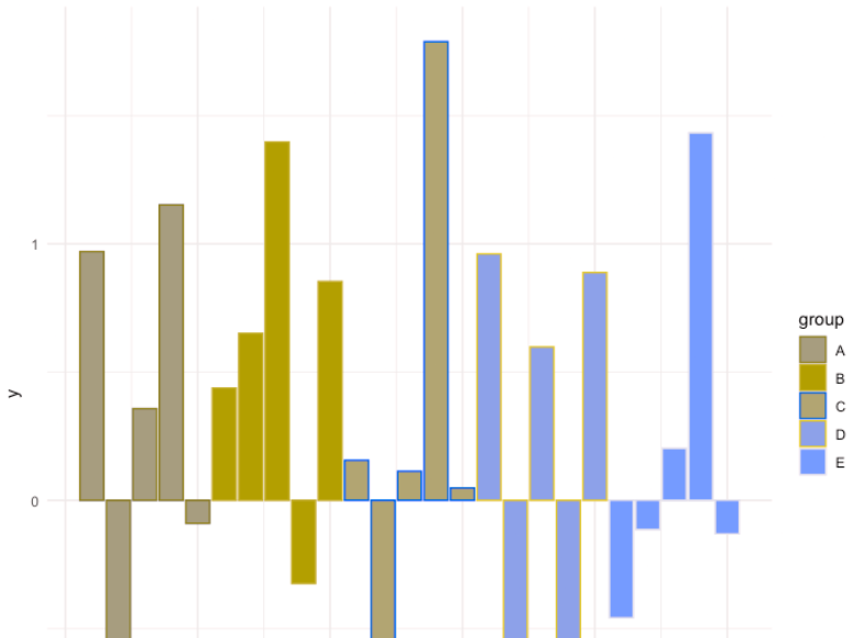
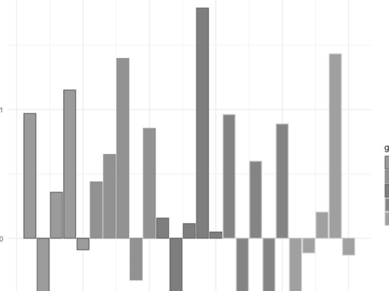
Press "Enter" to skip to content

Category: Visualization

Tooltip Design with CSS

Tim Brock takes on tooltips:

While colour-highlighting can be a great way of emphasizing part or parts of a chart or diagram, it doesn’t usually add precise information, which was important to the client. To add this precise information we used a tooltip. But to make them as effective as possible we had to spend a bit of time refining their design.

Click through for several tips on tooltip design, including a technique to minimize tooltip occlusion (in other words, the tooltip blocking important information underneath it).

Comments closed

Tips for Enhancing Power BI User Experience

Mara Pereira provides some guidance:

Before we dive into the nitty-gritty, let’s address the elephant in the room – what exactly is user experience, and why is it such an indispensable factor in reporting and Power BI?

To put it simply, user experience (UX) is the overall impression and interaction your audience has with your report. It goes beyond aesthetics; UX focuses on the ease of understanding, navigation, and the ability to extract valuable insights from the data presented. In the world of reporting, having a top-notch user experience is crucial, as it can make or break the effectiveness and adoption of your reports.

The post stays mostly at a high level, providing motivational guidance rather than “here are the specific actions to take on a given report.” What it does provide is the reasoning behind why you would make those changes.

Comments closed

Building a Unit Chart

Elizabeth Ricks describes a type of visual:

Unlike other charts that use line length, position on an axis, or area to represent values, unit charts are made up of individual markers—geometric shapes, icons, images, etc—that encode quantities based on how many of that unit are shown. Examples of unit charts are ISOTYPE charts, square area charts (also known as waffle charts), symbol charts, and pictorial charts. They are commonly used in media, advertisements, and infographics. 

Click through for some good use cases for unit charts.

Comments closed

The Problem with Stacked Bar Graphs

Rita Fainshtein looks at a stacked bar graph:

Let’s look at what motivated our choice and whether it is indeed a graph that will convey accurate messages to those who read it.

Here are some reasons why this type of visualization is preferred:

1. The graph on the right is one of the “recommended” graphs provided by tools (both Excel and Power bi).

2. It seems logical: there is a height comparison between case managers, clear separation between client types and the graph looks colorful and appealing.

But behind this, there are some major problems with the visual. Read on to learn what those are and for one alternative visual which can be better.

Comments closed

Alt Text in R

Nicola Rennie looks at different ways to incorporate alt text in R-based images:

Alt text (short for alternative text) is text that describes the appearance and purpose of an image. Alt text has multiple purposes, the main one being that it aids visually impaired users to better understand your content when the alt text is read aloud by screen readers. Alt text is also used in place of an image if it fails to load, which means that users with poor internet connection are more likely to be able to engage with your content.

The ggplot2 example was an interesting one, as I hadn’t ever added alt text to an image there.

Comments closed

Building a Shiny App to Show Star Maps

Benjamin Smith builds a UI:

Recently, I released a R package called starBliss that aimed to replicate the output of a e-commerce site called MapsForMoments – a site which lets users order custom prints of the night sky on the date of their choosing (usually a special occasion such as a birthday, first date, wedding etc.) and allows them to choose a style, and add some custom text. It was a great experience getting to build the package which replicated the MapsForMoments product and I was shocked to see how well it was received when I posted about it- with the Github receiving over 30 stars at the time of writing this blog!

I decided to take this to the next level by trying to build a similar UI in shiny which allows the user to create a custom star map and not need to use the R console. In this blog I share my experience constructing and showcase the “free alternative” to MapsForMoments – starBlissGUI!

Click through to see how you can run the app, as well as a sample output.

Comments closed

Customizing Shiny Apps with shinydashboard

Mandy Norrbo isn’t satisfied with the defaults:

Using {shinydashboard} is great for creating dashboard prototypes with a header-sidebar-body layout. You can quickly mock up a professional looking dashboard containing a variety of outputs, including plots and tables.

However, after a while, you’ll probably have had enough of the “50 shades of blue” default theme. Or, you might have been asked to to follow company branding guidelines, so you need to replace the default colours with custom ones.

Click through for a walkthrough of what is available for customization and how to do it.

Comments closed

Tracking Home Heating Oil Prices in R

Steven Sanderson charts some prices:

If you live in New York and rely on heating oil to keep your home warm during the colder months, you know how important it is to keep track of heating oil prices. Fortunately, with a bit of R code, you can easily access the latest heating oil prices in New York.

The code uses the {dplyr} package to clean and manipulate the data, as well as the {timetk} package to plot the time series.

Read on for an overview of what the code does, followed by the code itself and a time series plot at the end.

Comments closed

AR and VR in Data

Corrinna Peters differentiates augmented reality from virtual reality:

Virtual Realty (VR) and Augmented Reality (AR) is everywhere, with a broad variety of applications across many industries, and the potential to revolutionise many others. The potential of VR and AR technology is endless and drives digital transformation. Lots of market research studies are projecting that VR and AR is forecasted to grow exponentially in the next few years. With this in mind, the questions people are starting to ask themselves are – what does this mean for me? What does this mean for my business? How will this change data and analytics? What are the differences?

In the medium term, I am quite pessimistic on the topic. There are specific use cases where virtual reality can be interesting, such as a virtual house walk-through. But for the most part, the problem with VR is that optical quality is still not good enough, meaning that a lot of people struggle to use a VR headset for more than an hour or so before getting nauseous. There are also problems with the lack of tactile sensation (and haptic feedback can only go so far) and ergonomic challenges when you’re constantly raising your arms to perform actions.

Augmented reality has an easier sell, though, in cases where you’re willing to hold a phone or tablet up against something. For this scenario, think museum pieces, where you hold the phone up and get more information about the piece, artist, and style. Google does have AR for walking directions, with the cost of burning a whole bunch of battery life. But the general failure of HoloLens and wearable AR devices, as well as the inherent privacy concerns from flashing your active camera around crowded areas, dampen the mood a bit for AR.

Comments closed