Recently, I wrote an article, Rank and Sort Data Based on Multiple Columns in Power BI Using DAX. However, it is very common for business users to request the ability to dynamically view the Top N and Bottom N values of a measure, like Total Sales, on the same visual. This requirement is simple to implement on either the Top or Bottom N options. But, the challenge is when we need to represent the two options on the same chart simultaneously.
Have you ever found yourself staring at a graph or slide, wondering what the creator was trying to convey? Perhaps you’ve sat through a presentation, only to be left scratching your head, unsure of what to do next. Don’t put your audience in this same uncomfortable position. Instead, connect the dots for them to make it clear what the point is and what action they should take. When you fail to explicitly state the purpose of your communication, you run the risk of the important insight being lost, or someone arriving at the wrong conclusion.
Read on for an example of comparing resource plans to actual allocations and moving from showing data to telling a story.
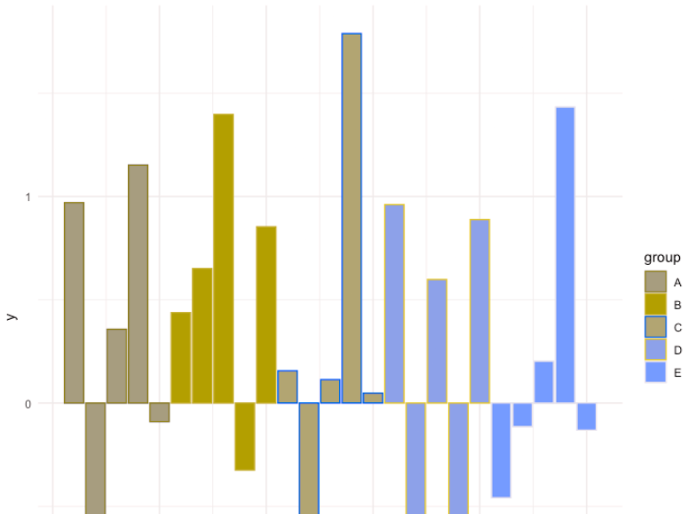
A simple, yet effective way to set your colour palette in R using ggplot library.
Click through for the demonstration. Tomaz keeps the text very light in this post, so I’ll do a little vamping of my own. Creating a custom palette is neat, but do make sure that your custom palette works for users with color vision deficiency (CVD). Taking Tomaz’s bar chart into Coblis (an amazing tool I continue to use quite regularly), here’s what it looks like for people with protanopia—that is, no red cones in their eyes:
It’s not awful, particularly because Tomaz changed the fill but not the border color, so you get a funky striation effect.
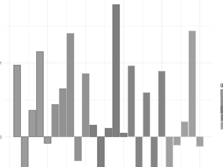
But the real kicker is if you switch to the monochromatic option in Coblis.
Granted, I know of exactly one person with monochromacy, so if you want to be fair, this isn’t one I’d check for on a webpage. But the large majority of technical books have grayscale images because it saves money on printing, so if this were your sweet-looking color scheme and you’re adding the image into a book, readers would need to focus particularly hard on the bars to figure anything out.
Effective reports and dashboards should enable users to quickly answer their data questions so that they can focus on their primary business tasks and responsibilities. To help you design effective reports, we introduce the3-30-300 rule for information design.The 3-30-300 rule is a straightforward and practical approach for you to produce efficient report layouts by structuring reports in a functionally hierarchical way. This rule concisely paraphrases the visual information-seeking mantra from Ben Schneidermann (1996). To make it easier to understand for Power BI developers, we express this rule with respect to approximately how long it should take users to get certain information or perform certain tasks in a report.
It’s a clever mnemonic and Kurt does a good job of showing how you could implement it.
Of late, I’ve been falling down a bunch of geospatial rabbit holes. One thing has remained true in each of them: it’s really hard to debug what you can’t see.
There are ways to visualize these. Some more-integrated SQL development environments like pgAdmin recognize and plot columns of geometry type. There’s also the option of standing up a webserver to render out raster and/or vector tiles with something like Leaflet. Unfortunately, I don’t love either solution. I like psql, vim, and the shell, and I don’t want to do some query testing here and copy others into and out of pgAdmin over and over; I’m actually using Leaflet and vector tiles already, but restarting the whole server just to start debugging a modified query is a bit much in feedback loop time.
Calculating cumulative percentage or percentage per group for each time can sometimes be a task with a slight twist. Let’s check this with ggplot2 and tidyverse.
Click through for three separate ways of doing this.
There are plenty of ways to visualize data. There’s PowerBI, Tableu, and a plethora of other options. What about taking the results of a SQL query and creating a graph in PowerShell? Probably not ideal, but is it possible? Let’s see what this might look like.
The thought occurred to me more out of curiosity than it being something I’d use. Admittedly, I’m not proficient enough in PowerShell to quickly build something from scratch. To get an idea of how it might look, I took this as an opportunity to outsource most of the work to Microsoft Copilot to see if I would get anything useful.
If you want to get fancy, I’d recommend Plotly, which has support for the best .NET language (F#) and you can also use it with those other .NET languages (C#, Powershell). There’s no explicit quickstart for Powershell but you can Powershell-itize the C# code pretty easily.
The Button Slicer is one of the recent visuals that is very helpful in taking your report layout and visualization to the next level. Although this visual has been available for some time, many are still unfamiliar with its features. In this article and video, I’ll take you through this visual, its features, and how you can use them to have a better Power BI report layout.
Read on to see how (at least until it’s out of preview) you can get access to the visual, as well as what you can do with it.
Have you ever wanted to filter a visual by selecting a range of values for a measure? You may have found that you cannot populate a slicer with a measure. But you can do this another way.
I have a report that shows project expenses and budgets. I want users to be able to filter the list of project to only those which have expenses within my selected range. I also have 2 other slicers for project budget and percent of budget used, but let’s just focus on the expense amount slicer.
I recently found myself in a situation where I had to optimize a Spark query. Coming from a SQL world originally I knew how valuable a visual representation of an execution plan can be when it comes to performance tuning. Soon I realized that there is no easy-to-use tool or snippet which would allow me to do that. Though, there are tools like DataFlint, the ubiquitous Spark monitoring UI or the Spark explain() function but they are either hard to use or hard to get up running especially as I was looking for something that works in both of my two favorite Spark engines being Databricks and Microsoft Fabric.
Read on for Gerhard’s answer, including an example of it in action.