Being a good data storyteller means using all the tools at your disposal. This includes color. It is important to note that I’m not advocating the use of color only in your reports – you need to ensure that there is another method to discern what’s going on with the data for those in your audience who might be colorblind. But that doesn’t mean we can’t play around with color and use it to add meaning to our reports.
Most people I know would agree that GREEN means ‘Good’ and RED means ‘Bad’. But colors can be very personal. For example, my favorite color is BLUE and it was also the color I chose for my math notebooks throughout school. (Yes, math was my favorite subject – I guess it’s no surprise I ended up in a career that works so much with data.)
In addition to personal meaning of colors, there can also be cultural meanings around individual colors, and that can shape how individuals view a given color. Grace Fussell has one of my favorite articles on the topic.
In this video, I extend a Streamlit app that I created in the prior video. This extension will include retrieving data from SQL Server, caching function results, operating a set of simple filters, and displaying visuals using tabs.
Click through for the video, as well as the code that I used.
In this post I will guide you through creating this chart in Power BI – it is a stacked bar chart that show the size/impact of three different measures – Sales Value, Sales Units and Avg Price in one visual.
It’s not a visualization that I would recommend but there might be use cases for it somewhere and it has been a good exercise in what we can do with visual calculations.
In this video, I talk about Streamlit, a great Python library for building data applications quickly. We discuss what data applications are, get an idea of how Streamlit compares to other code-first data visualization techniques, and start building a demo application. I also toss in a lengthy sidebar on Python virtual environments because of how important they are.
Streamlit certainly has its foibles—many of which I’ll cover in the series—but I like it a lot as a simple way of building data applications.
Power BI reports have a theme that specifies the default colors, fonts, and visual styles. In Power BI Desktop, you can choose to use a built-in theme, start with a built-in theme and customize it, or create your own theme.
Creating your own theme involves specifying formatting options in a JSON file and importing it into your report. This post will focus on the theme colors, but there are lots of other options that can be specified in a theme, including structural colors, fonts, and page and visual formatting options.
Read on to learn more about the three primary sets of colors you can specify.
The main criticism people have when it comes to ggplot2 is the static nature of the charts it has to offer. Truth be told, it will never be an interactive visualization king like Highcharts, but it doesn’t mean animation is out of the picture.
Meet R gganimate – a natural extension of ggplot2 that allows you to visualize your data change through time or some other variable, and then render and export the chart as a set of PNGs, or a single GIF/MP4.
Click through to learn more about it. I remembered the original gganimate and was going to say, “Wow, I hadn’t heard of that library in forever.” But it turns out that Thomas Lin Pedersen built a newer version of the library and has added in quite a bit of functionality since the last time I looked. H/T R-Bloggers.
Recently, I wrote an article, Rank and Sort Data Based on Multiple Columns in Power BI Using DAX. However, it is very common for business users to request the ability to dynamically view the Top N and Bottom N values of a measure, like Total Sales, on the same visual. This requirement is simple to implement on either the Top or Bottom N options. But, the challenge is when we need to represent the two options on the same chart simultaneously.
Have you ever found yourself staring at a graph or slide, wondering what the creator was trying to convey? Perhaps you’ve sat through a presentation, only to be left scratching your head, unsure of what to do next. Don’t put your audience in this same uncomfortable position. Instead, connect the dots for them to make it clear what the point is and what action they should take. When you fail to explicitly state the purpose of your communication, you run the risk of the important insight being lost, or someone arriving at the wrong conclusion.
Read on for an example of comparing resource plans to actual allocations and moving from showing data to telling a story.
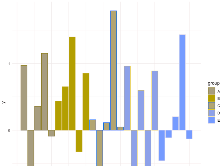
A simple, yet effective way to set your colour palette in R using ggplot library.
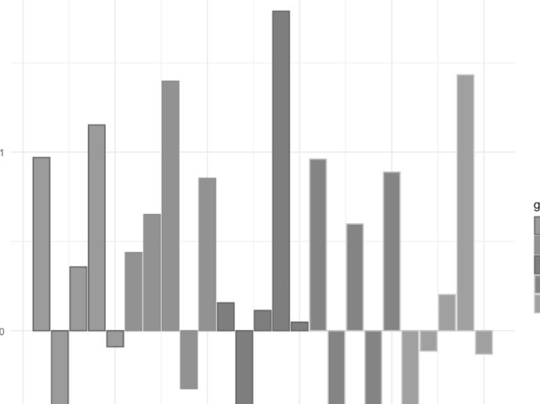
Click through for the demonstration. Tomaz keeps the text very light in this post, so I’ll do a little vamping of my own. Creating a custom palette is neat, but do make sure that your custom palette works for users with color vision deficiency (CVD). Taking Tomaz’s bar chart into Coblis (an amazing tool I continue to use quite regularly), here’s what it looks like for people with protanopia—that is, no red cones in their eyes:
It’s not awful, particularly because Tomaz changed the fill but not the border color, so you get a funky striation effect.
But the real kicker is if you switch to the monochromatic option in Coblis.
Granted, I know of exactly one person with monochromacy, so if you want to be fair, this isn’t one I’d check for on a webpage. But the large majority of technical books have grayscale images because it saves money on printing, so if this were your sweet-looking color scheme and you’re adding the image into a book, readers would need to focus particularly hard on the bars to figure anything out.