Tomaz Kastrun pulls out the color swatches:
A simple, yet effective way to set your colour palette in R using ggplot library.
Click through for the demonstration. Tomaz keeps the text very light in this post, so I’ll do a little vamping of my own. Creating a custom palette is neat, but do make sure that your custom palette works for users with color vision deficiency (CVD). Taking Tomaz’s bar chart into Coblis (an amazing tool I continue to use quite regularly), here’s what it looks like for people with protanopia—that is, no red cones in their eyes:
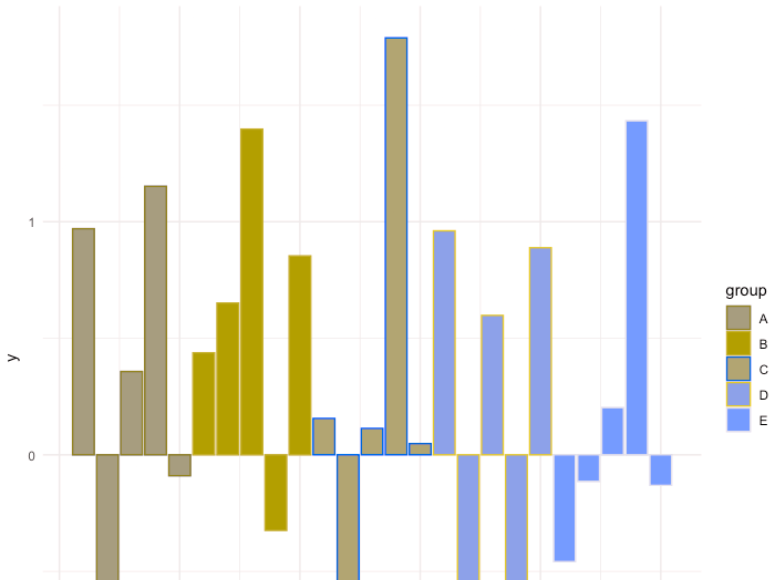
It’s not awful, particularly because Tomaz changed the fill but not the border color, so you get a funky striation effect.
But the real kicker is if you switch to the monochromatic option in Coblis.
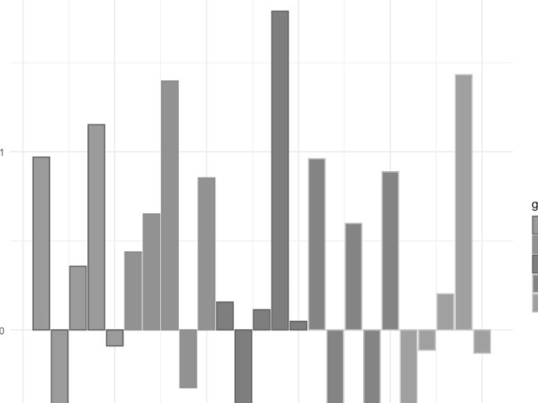
Granted, I know of exactly one person with monochromacy, so if you want to be fair, this isn’t one I’d check for on a webpage. But the large majority of technical books have grayscale images because it saves money on printing, so if this were your sweet-looking color scheme and you’re adding the image into a book, readers would need to focus particularly hard on the bars to figure anything out.
Comments closed