Mike Cisneros explains what radar (or spider) charts are and how they work:
A spider chart, also sometimes called a radar chart, is often used when you want to display data across several unique dimensions. Although there are exceptions, these dimensions are usually quantitative, and usually range from zero to a maximum value. Each dimension’s range is normalized to one another, so that when we draw our spider chart, the length of a line from zero to a dimension’s maximum value will be the same for every dimension.
Spider charts can be found in lots of industries, but rarely in large numbers. In our experience, they’re most likely to pop up in food science (comparing products across multiple different facets of taste, texture, etc.) and in sports analytics (comparing athletes across several dimensions of performance). In one of our previous #SWDchallenges, several participants found other use cases for spider charts, such as comparing series on a time-cycle, comparing the volume of searches for different terms, or even visualizing the motifs in a piece of music.
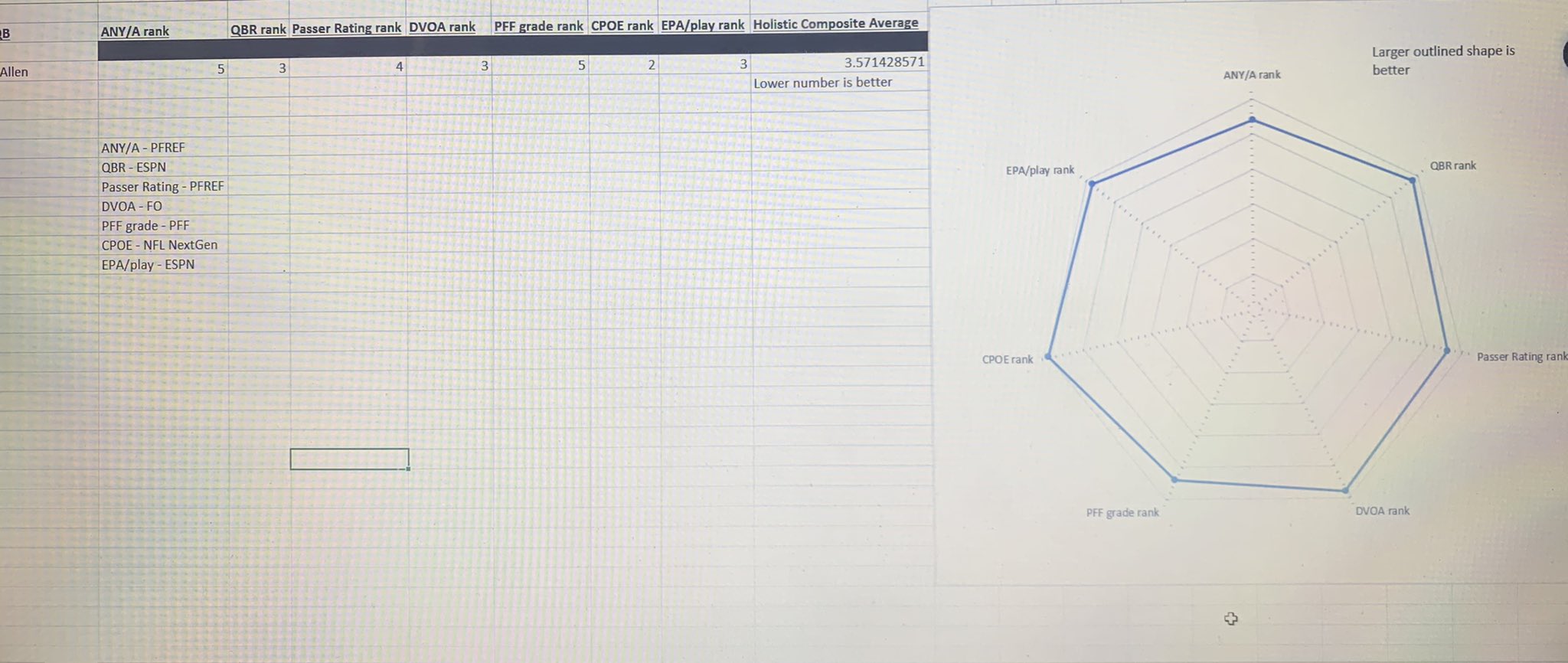
My favorite use of the radar chart was in the Madden NFL series, where I spent far too much of my youth comparing attributes between prospects—for example, the quarterback radar chart might have throwing power, throwing accuracy, speed, strength, and awareness. Then, you compare the relative sizes and spikes of players to gauge who would be better. (Except that in the case of Madden, it was all a lie—turns out the radar charts weren’t actually based on anything, so as usual, a youth wasted).
More recently, Bruce Nolan came up with a radar chart to visualize quarterback play across a set of complementary measures: