DateSerial function accepts three paramter values year,month and day and return a valid date value with time set to midnight. SQL Server does not support this function until version 2012 is released.
There can be many ways to simulate this functionality. Here are 10 different ways
I’d be pretty upset if some of those were in my code base, but this shows that there are plenty of ways to get to the same result. Just, uh, don’t use all of them.
In late 2019, a project that had been in progress for well over a year finally came to a conclusion. I had collaborated with a number of people to migrate a stand alone SQL Server 2008 and two stand alone SQL Server 2008 R2 instances. Each stand alone SQL Server was migrated to a three node Availability Group. Here are a few things learned along the way.
There is a well known and broadly advertised message from Microsoft that Azure Data Factory (ADF) is a code-free environment to help you to create your data integration solutions – https://azure.microsoft.com/en-us/resources/videos/microsoft-azure-data-factory-code-free-cloud-data-integration-at-scale/. I agree and support this approach of using drag and drop visual UI to build and automate data pipelines without writing code. However, I’m also interested to try if I can recreate certain ADF operations by writing code, just out of my curiosity.
Rayis includes a link to the Azure Data Factory step-by-step demonstration and then kicks it up a notch with Databricks. Read on to see how the two compare.
Net Promoter Score (NPS) surveys are one of the most common ways of knowing how customers perceive a product or service. Basically, they consist of two stages: first, you ask a customer to score a business from 0 to 10, then you ask them to give reasons for the score they leave with open-ended question.
When it comes to processing the results, the first stage is easy: you just have to calculate the average score. But when it comes to analyzing tons of open-ended NPS responses, the analysis becomes more complicated. Imagine if your team had to tag hundreds of responses manually. Not only it would be a tedious and time-consuming task, it may also lead to inconsistent results derived from different criteria during the tagging process.
It might just be the industry I’m in, but I don’t really get excited about sentiment analysis. Still, don’t let my biases influence your thought process too much.
When we use slopegraphs, we are trying to show one specific thing: is the value in the first column higher, lower, or the same as the value in the second column? That change is easy to see when we connect those values with lines, because the lines will slope up or down, in the direction of the change.
The steeper the slope, the bigger the change; and, if one thing is going up more dramatically than its neighbors, a slopegraph will make that easier to see than a traditional line graph would.
Mike has some examples of where slopegraphs make sense as well as cases when they don’t.
The icons are svg, so while they work in PowerPoint, adding them to something like this post in OpenLiveWriter doesn’t work. However, I could make a quick diagram and capture an image of it.
Not great, but it shows I can put icons on a page with arrows.
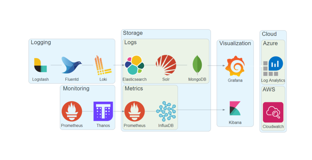
Going one step further, I’ve been digging into Diagrams by mingrammer lately. With it, you use Python to generate diagrams, and there are quite a few Azure icons in there, as well as AWS, on-prem, etc.
Here’s a quick example of what you can do, taken from an upcoming talk of mine:
There are some limitations based on the underlying library, such as how you can’t connect cluster to cluster—meaning I can’t draw a line from “Logging” to “Storage\Logs”; I have to draw it from a particular element (Loki) to a particular element (Elasticsearch). In a lot of traditional reference architecture diagrams, though, that isn’t a problem.
There is a lot of blog posts in the Internet about how to use Lookup and other functions of this type in SSRS. It is very straight forward and easy to use. However, I’ve managed to make a mistake and I assume have the same problem if you got to that page.
Read on to see the error as well as the wrong way and the right way to solve the problem.
Fact: You should never blindly trust anything you find on the internet. And right now, you are reading the internet. So why should you trust this? You shouldn’t. At least, not blindly. You should verify. And what better way to verify then through demos!
There went my strategy of blindly trusting Hugo.
The rule of thumb I have heard and go by is, if you’re retrieving less than 1/2 of 1% of data, a seek is the best route. If you’re returning more than 20% of data, a scan is the best route. In between is the “it depends” zone, where either could potentially be better. But please do read Hugo’s post—it’s an important one for query tuners.
When I build models – I use Excel pivot tables to test and validate my measures and typically I would use DAX Studio to find the localhost port to setup a connection to the currently open PBIX file.
So, I thought it be nice just to click a button in PowerBI Desktop to open a new Excel workbook with a connection to the current model. That would save me a couple of clicks.
If I could create an ODC file when clicking on the button in Power BI and then open the ODC file (Excel is the default application to open these) my idea would work.
And that’s exactly what Erik has done, using Powershell to do the work.
Yes, really! I build and External Tool to document your Power BI Model. I know, documentation is not a very famous topic, but I believe a very important one! Lead time from data to insights is very short with Power BI, but often we forget to look back on what kind of monster we created. Especially if you want to share the dataset for reuse, I believe it is important to deliver some documentation as well. Maybe you even promote or certify this dataset in the future, which implicates that the model matches certain quality metrics and best practices.
Read the whole thing and check out Marc’s offering.